

Paso Robles Horse Park
Paso Robles Horse Park
Objective
Lead branding efforts for equestrian shows at Paso Robles Horse Park (The Park) and design prize lists, social media graphics, and advertisements to enhance the shows’ visual identity and promotion.
Scope of Work
Branding
Marketing Design
Role
Graphic Designer
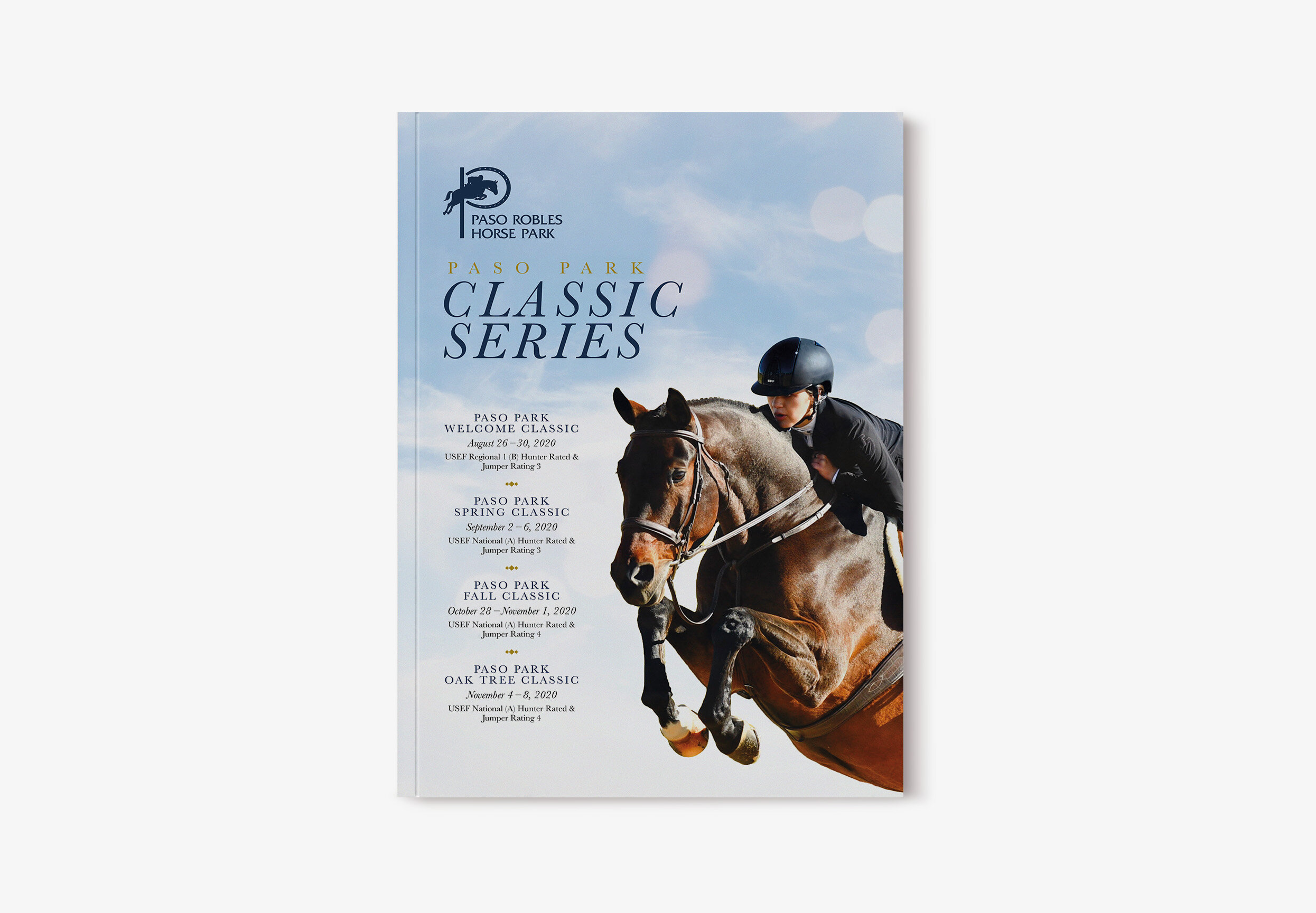
Classic Series
Branding
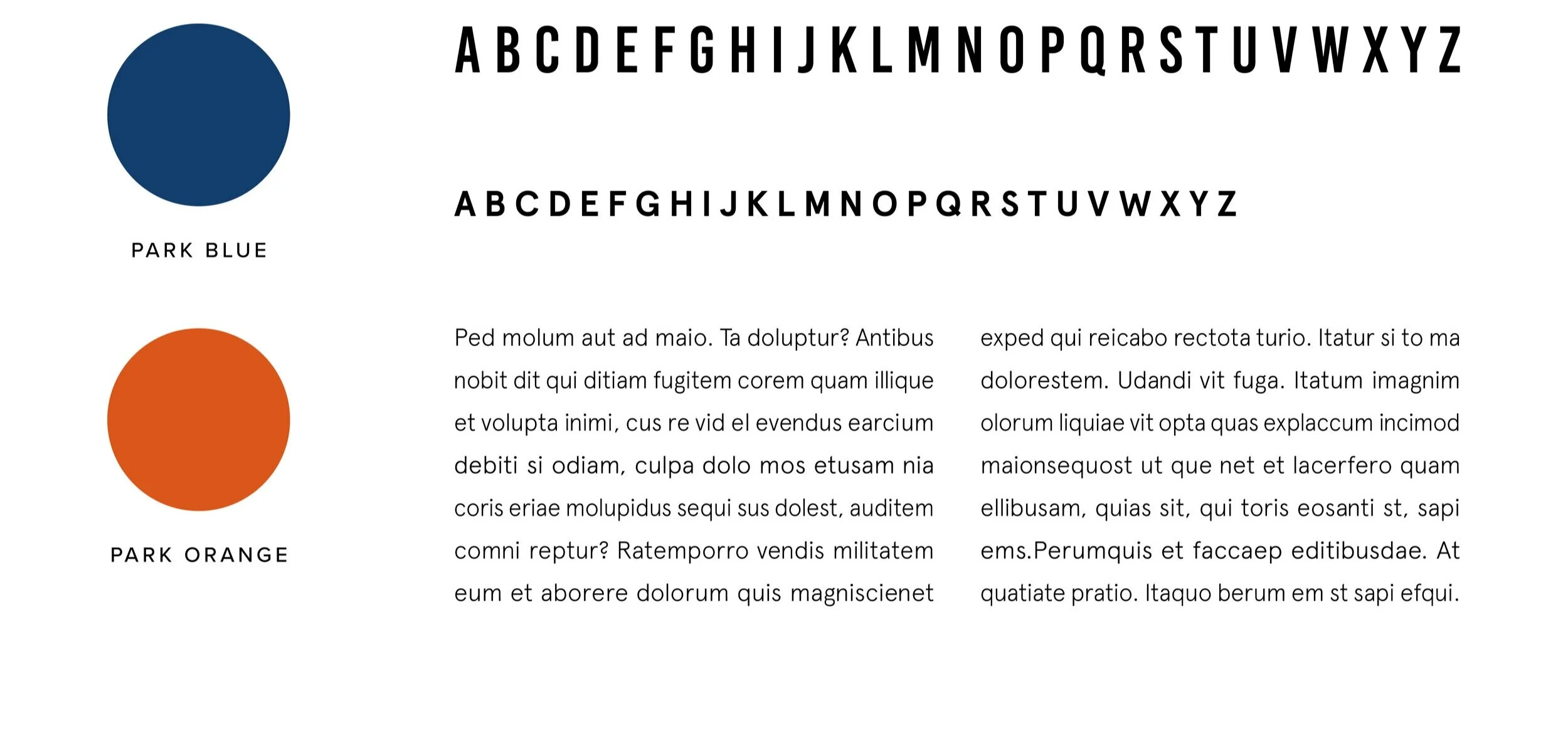
The Park’s standard branding uses the colors blue and orange. After swapping out orange with gold and incorporating a slightly darker blue, these colors coupled with the type combination of Baskerville and Proxima Nova elevates the Classic Series’ sophisticated and prestigious reputation.

Primary
Baskerville Regular
Secondary
Proxima Nova Medium
Tertiary
Baskerville Italic
Body Paragraph
Proxima Nova Regular
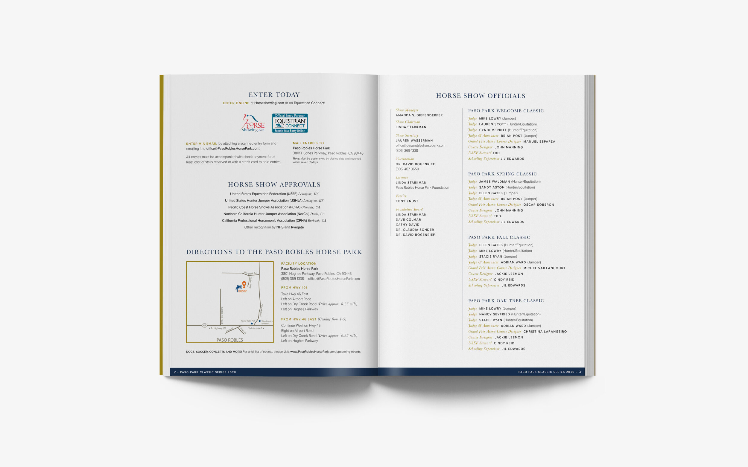
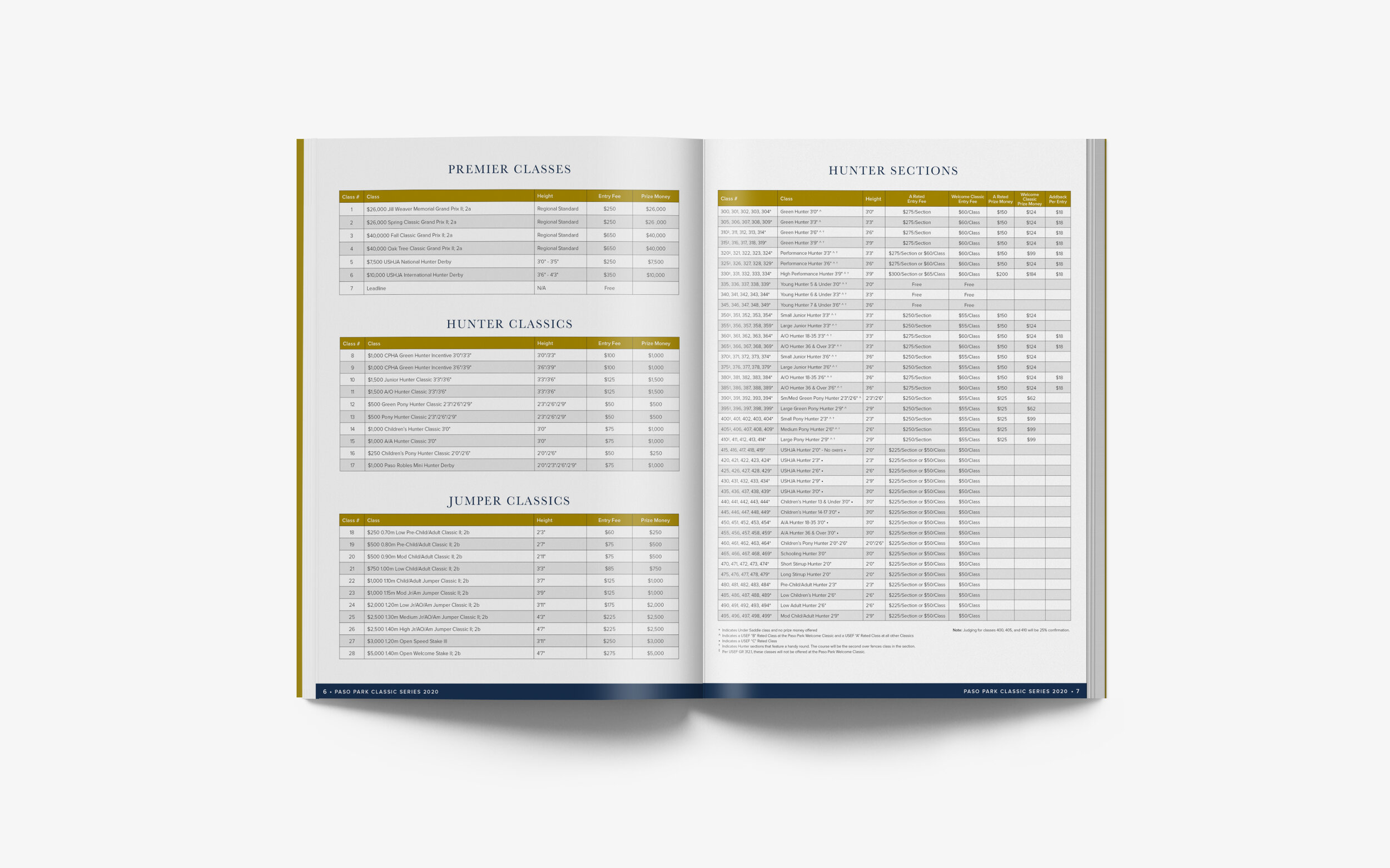
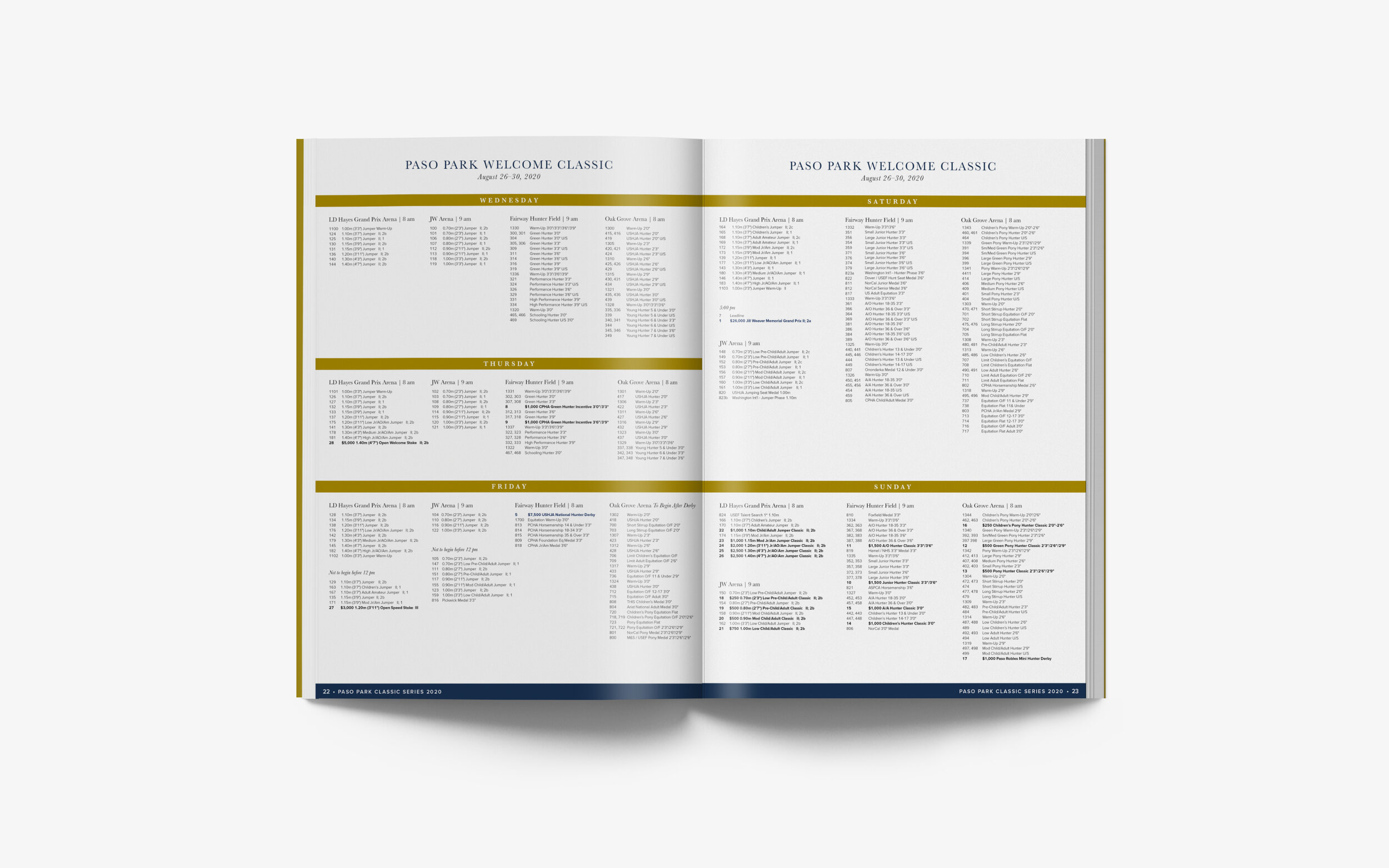
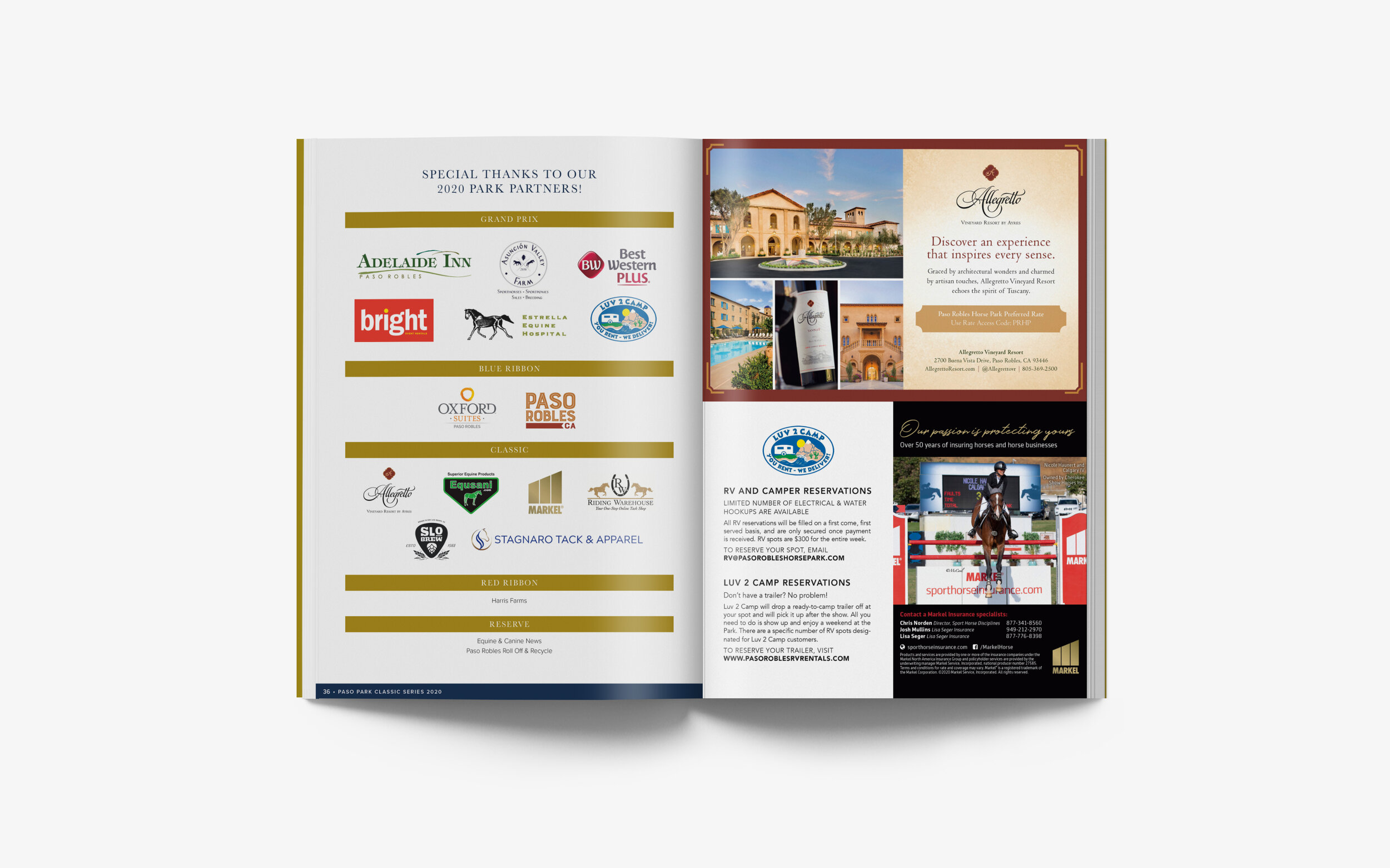
Classic Series Prize List
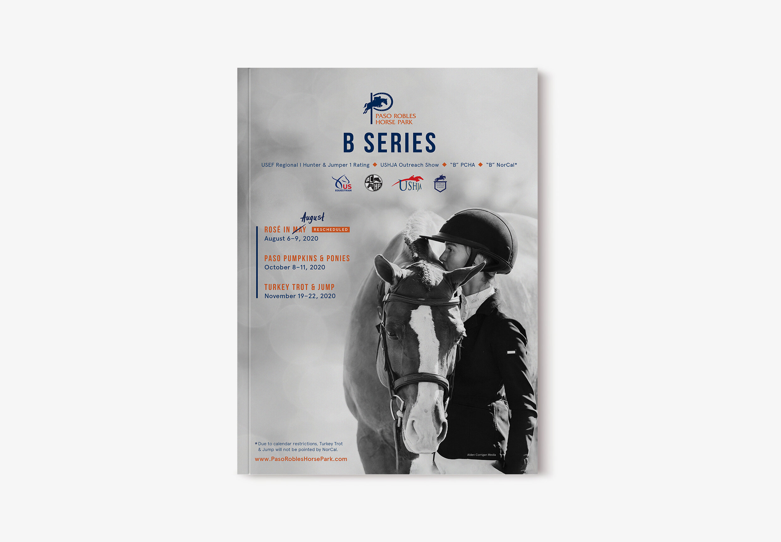
B Series
Branding
By combining the Park's signature colors with the bold yet approachable characteristics of Bebas Kai and Apercu typefaces, the design captures the attention of the diverse B Series audience, which encompasses both elementary and competitive riders.
Primary
Bebas Kai
Secondary
Apercu Bold
Body Paragraph
Apercu Light
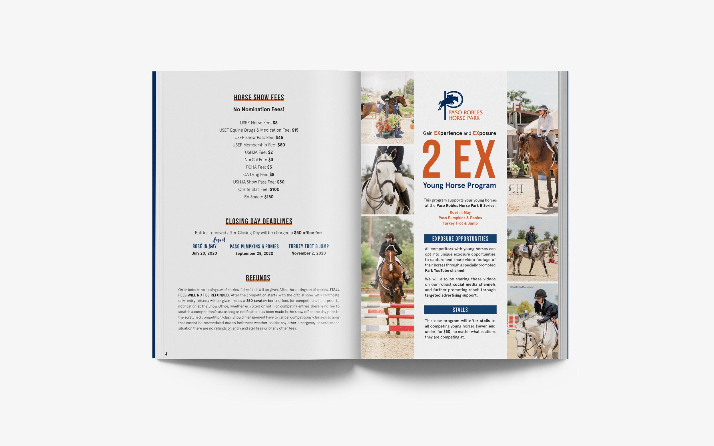
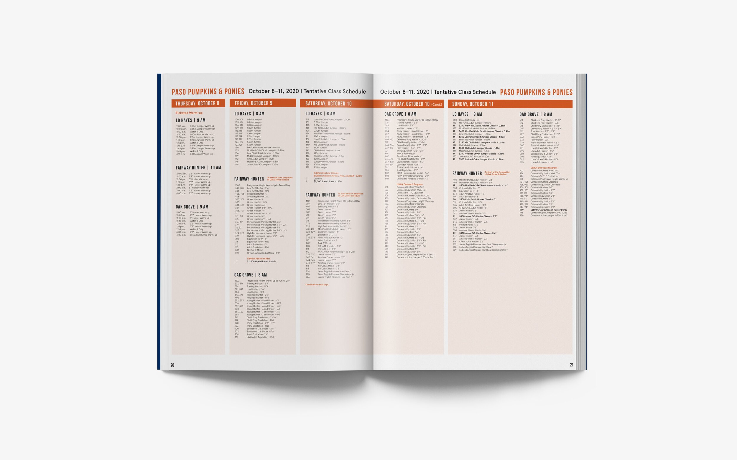
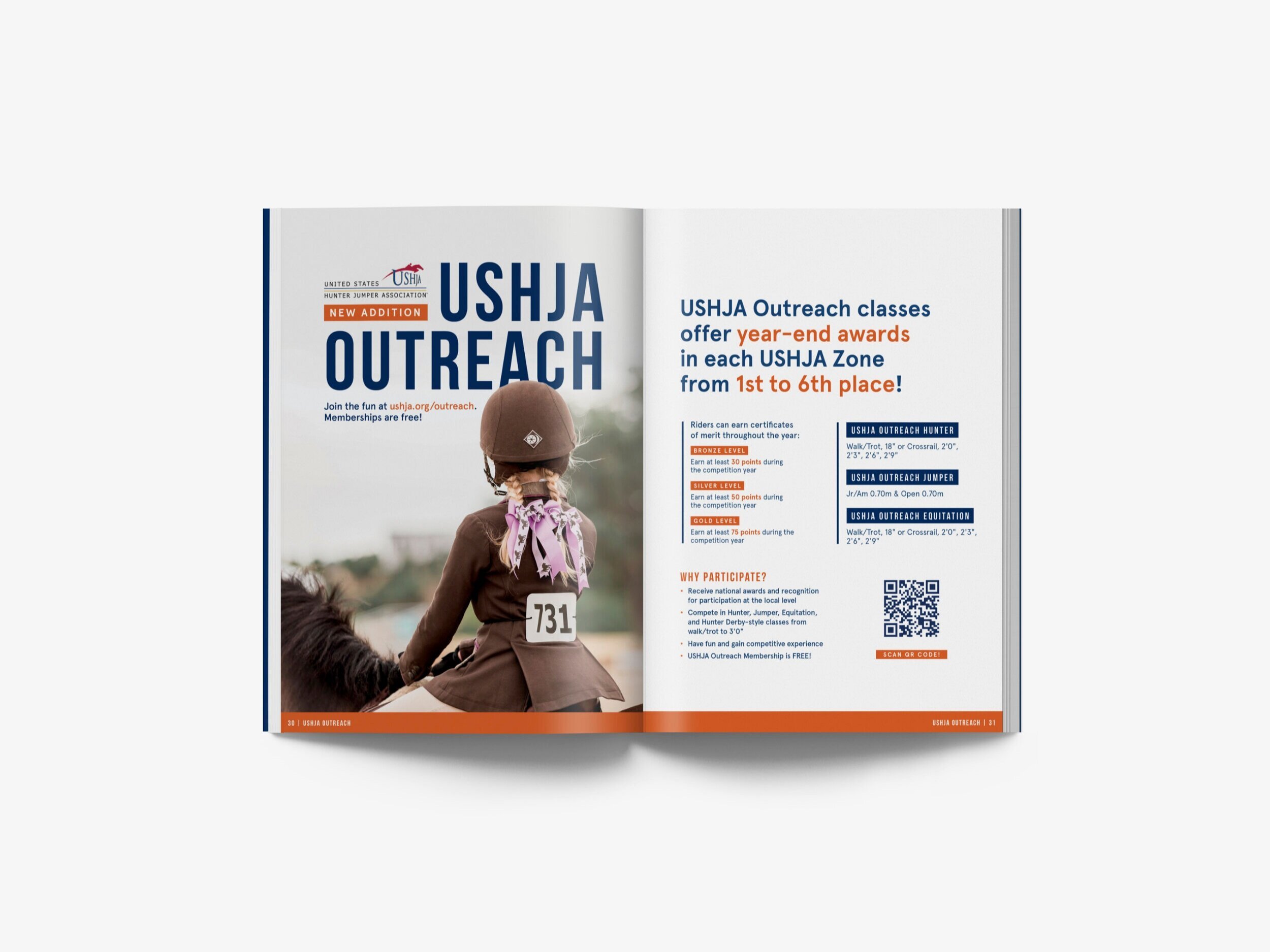
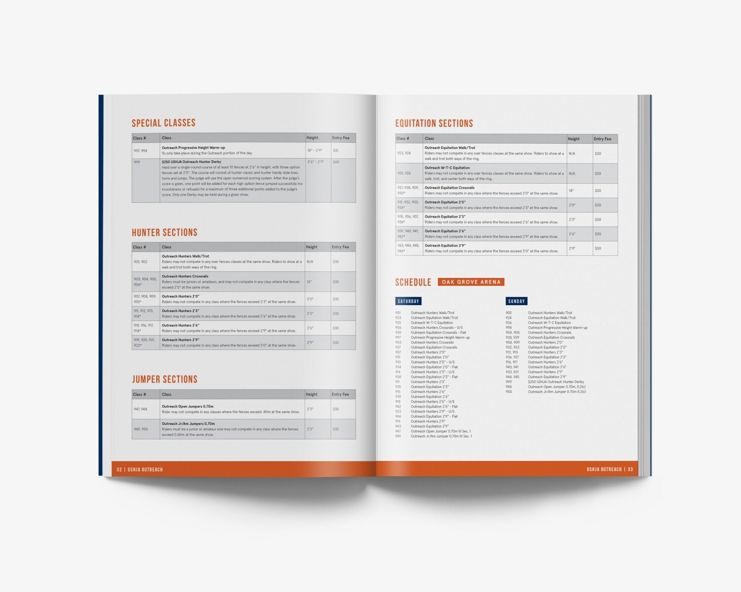
B series Prize List
Social Media Graphics
The branding for both shows were incorporated in various social media graphics.
Classic Series show Schedule

6 Things to Do Before the B Series Show

#COVIDCOOL Campaign
Undertaking horse shows during the unprecedented times of COVID-19 presented unique challenges. To prioritize the safety and well-being of staff and competitors in an innovative and enjoyable manner, The Park launched a #CovidCool campaign. As part of this initiative, the campaign was designed to include printed flyers displayed throughout the Park and engaging social media content for Instagram stories.


Park Advertising
A unified design incorporating both the Classic and B Series branding fit various print and digital advertising formats.


