

Coca-Cola 48 Hour RePack
Coca-Cola
48 Hour RePack
Hi-Cone is a global supplier of ring carrier multi-packaging systems for leading soft drink companies, like Coca-Cola. To address the environmental hazards that the improper disposal of Hi-Cone yields, the Institute of Packaging Professionals challenged packaging-focused university students to prototype an alternative to Coca-Cola’s Hi-Cone in 48 hours.
Objective
Designed package graphics in line with Coca-Cola’s brand specs, filmed footage, and created animated assets for a marketing sales pitch video.
Scope of Work
Brand Consistency
Marketing Strategy
Packaging Design
Packaging Sustainability
Videography
Affiliation
Institute of Packaging Professionals, Southeastern Chapter — California Polytechnic State University
Team
Dominique Lau — Packaging Graphics & Video
Ashley Chen — Packaging Graphics & Video
Blaine Boyd — Structural Packaging Design
John Dizon — Structural Packaging Design
Accolades
1st Place out of 56
Project Scope
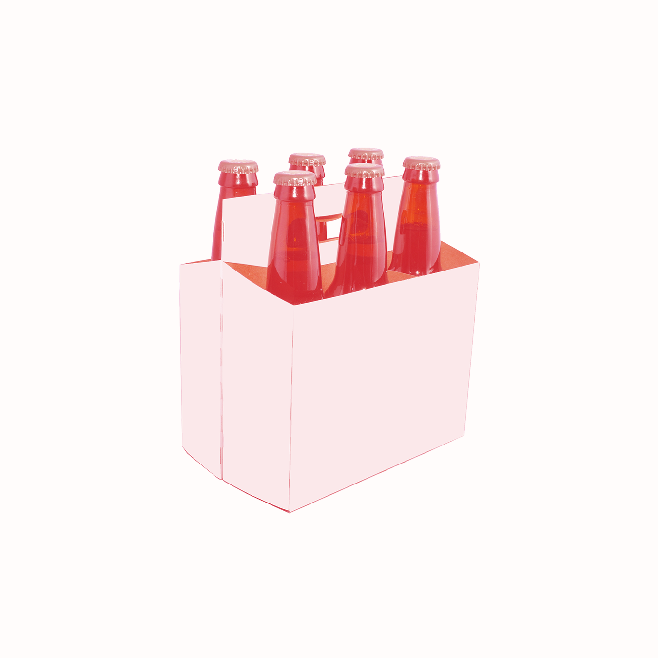
To redesign the 6-Pack 16.9 oz Bottle Coca-Cola Bundle OR the 6 or 8-Pack 7.5 oz Can Bundle.
We chose to redesign the 6-Pack 16.9 oz Bottle Coca-Cola Bundle.
48 Hour RePack Objective
Create Hi-Cone alternatives that are environmentally friendly, maintain structural integrity, are easy to collapse and recycle, and use as little packaging as possible.
The Drawing Board
We strived to design our prototype by honing in on each component of the competition objective.

Competitive Analysis
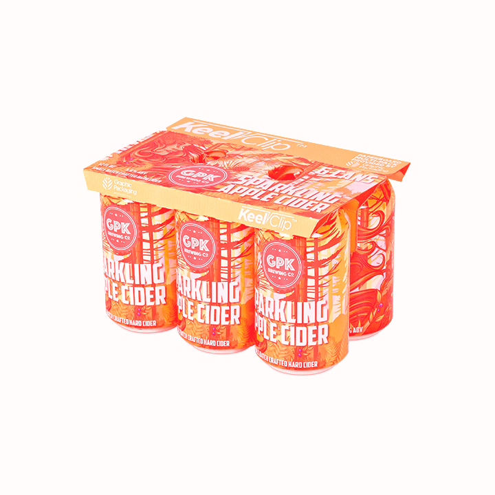
Our research showed that six-pack drink carriers for bottles and six-pack ring replacements for aluminum cans both existed. While most of these options revealed a corrugated fiberboard structure, the Keel Clip, a six-pack ring replacement for aluminum cans, boasted a paperboard structure.
Thus, the Keel Clip led our inspiration for creating an environmentally friendly paperboard solution for a six-pack carrier of bottles.
Minimizing Paper Usage
With the competition objective in mind, we decided to avoid using corrugated fiberboard. Instead, we opted for a more environmentally friendly material: clay coated news back (CCNB), a paperboard material made out of 100% recyclable paper.

Ashley is cutting a clay coated news back prototype with an exacto-knife.

John is studying the Coca-Cola bottle flanges to create an appropriate dieline.
Studying the Bottles
Before we began prototyping, John carefully examined the bottles and their flanges. Creating a successful way to hold the flange of the heavy plastic bottle, while minimizing package waste by reducing the use of CCNB, posed as our main challenge.
An Early Prototype
This early prototype shows an arched handle and tear strips. We soon discovered that both the die-cut of the arched handle and tear strips compromised the structural integrity of the package and could not withstand the heavy weight of the bottles. The handle and/or the tear strips ripped apart.
During this stage, we became more familiar with the material we were using — although clay coated news back is very environmentally friendly, it lacks in structural strength. Multiple prototypes were designed and tested to understand the best way to yield a compromise.

Blaine is standing behind an early prototype.

I am securing a more refined prototype to the bottles.
A Refined Prototype
Die-cut semi-circle handle insets replaced the arched handle and allowed for easier carrying. Unlike the arched handle, the semi-circle handle insets worked with the grain, increasing structural integrity.
We also increased structural integrity by using two walls of paperboard on all four sides. While this eliminated the tear strips, we decided that the sacrifice to preserve structural integrity was justified.
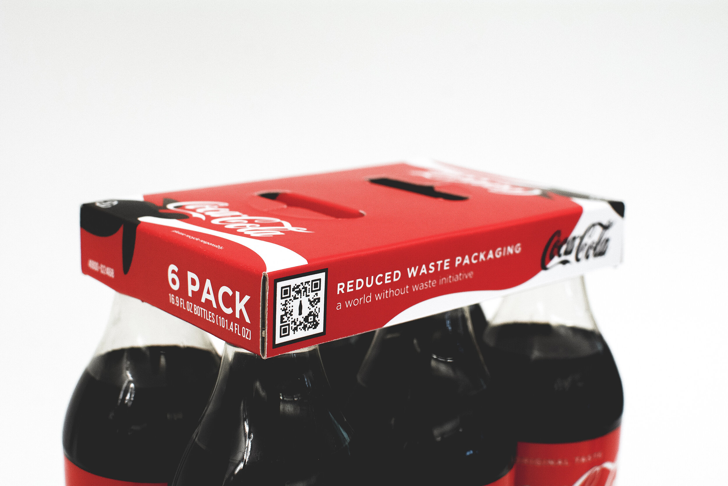
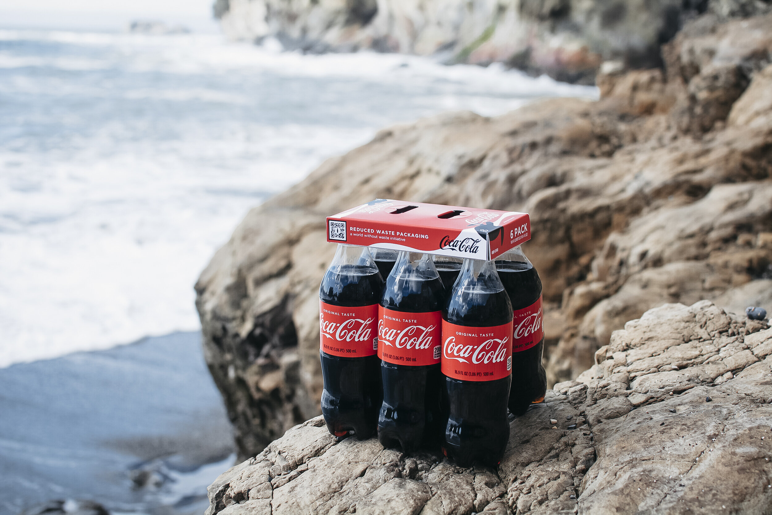
The Final Dieline
The final dieline consists of double walls on all four sides and die-cut semi-circle handle insets. This flat, built-in handle is designed for easy pickup and transportation, and allows for six-packs to easily stack on shelves. The six unique insert holes grip the flange of the bottle and feature a frayed cut to allow for easy bottle removal. They also make it easy for bottles to be bundled together in manufacturing.
The blank size of the prototype is 15.913 inches by 5.912 inches and uses 93% of the blank size area, minimizing the amount of material used to bundle the six bottles together.

Package Graphics
The graphic design process consisted of conducting extensive research on Coca-Cola’s current and past branding, advertising, and marketing styles. In doing so, we gained a better understanding as to how graphics could realistically match Coca-Cola’s current products on the shelf, yet promote Coca-Cola’s World Without Waste initiative.


Coca-Cola Branding
The Coca-Cola branding was kept consistent with its brand colors of red, black, and white. However, we strayed from using their branded silver color in order to prevent difficulties when direct printing for packaging; we found it unnecessary to go towards extensive manufacturing efforts due to the short life span of the paperboard.
We adhered to the Gotham font family branding to reflect Coca-Cola’s easily recognized visual identity.

QR CODE
Since each bottle wears its individual nutritional label, the classic Coca-Cola’s “sip & scan” QR code was replaced with a new QR code displayed on the paperboard that educates the consumer on the Coca-Cola company’s World Without Waste sustainability efforts, such as highlighting nearby facilities.
Sea Turtles
Hi-Cone packaging yields detrimental effects on sea life, specifically sea turtles that get wrapped into the plastic cutouts. Therefore, implementing turtles in the design elicits an emotional connection with consumers who realize that using this paperboard alternative will result in less plastic in the oceans, and thus, protect sea turtles.
The PaperPop
We named our final clay coated news back prototype the “PaperPop”.
Marketing — Sales Pitch Video
The sales pitch video gifted the opportunity to reveal and reinforce the PaperPop’s strong structure and branding components that advocate for recycling under Coca-Cola’s World Without Waste initiative.
Our Inspiration
In researching Coca-Cola’s past advertisements, we came across Coca-Cola’s 2019 Super Bowl commercial — an animated video based off of Coca-Cola’s brand colors. We push-pinned this hand-drawn concept as inspiration for the marketing sales pitch video.
Storyboarding
Ashley and I took charge of storyboarding for the sales pitch video. We planned to incorporate real film footage and animations to enhance the PaperPop’s environmentally friendly characteristic.


Animations
With a Wacom tablet, I drew Coca-Cola-advertisement-inspired assets and chose a similar textured brush to elicit the hand-drawn and warm feel. I then brought these assets into AfterEffects to create animations. Ashley compiled these animations with original film footage in Premiere Pro.
Final Sales Pitch Video
The video gives a holistic view of the PaperPop’s brand. It emphasizes the importance to take care of our oceans and its sea life. It offers consumers the opportunity to decide their role in the World Without Waste initiative.
Behind the Scenes
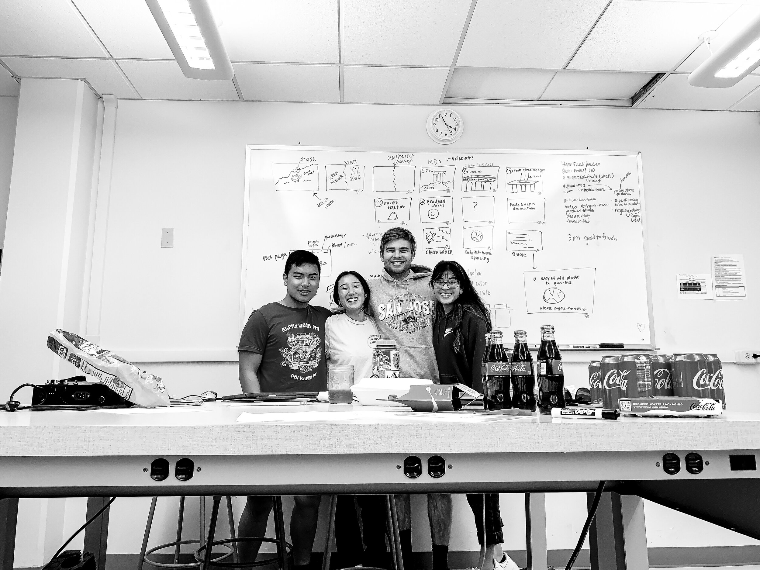
48 hours later! Our team and many leftover Coca-Cola bottles and cans.

Smiles all around after receiving first place in the competition.


