

Negranti Creamery (2021)
Negranti Creamery
Founded by Alexis Negranti in 2010, Negranti Creamery was the first creamery to sell 100% sheep’s milk ice cream on wholesale and retail levels in the United States. Based in Paso Robles, California, it continues to thrive as a family-owned and operated creamery. The Daily Meal ranked the creamery as the 4th best ice cream parlor in the world.
With photos that I styled and shot, I implemented an online merchandising storefront to the company’s website. I also led and executed an ice cream photoshoot and designed both the summer menu and ice cream sandwich packaging.
Scope of Work
Art Direction
Food Photography
Food Packaging Design
Menu Design
Merchandise Photography
Website Maintenance
Role
Freelance Designer
Background
I started working for Negranti Creamery one week before the COVID-19 pandemic had spread to the California Central Coast. Working remotely during these uncharted times not only challenged me to think proactively, but also encouraged me to become more resourceful and stretch my creativity.
The Online Storefront
Conveniently, I had taken photos of the merchandise two days before the shelter-in-place order was announced. With these photos, I designed and integrated an online storefront to Negranti Creamery’s website soon after. The proactive mindset that Alexis and I shared helped keep sales afloat while non-essential businesses, like the creamery itself, remained closed.

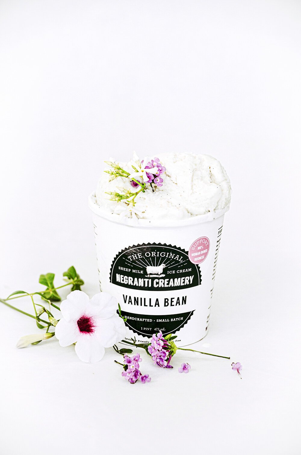
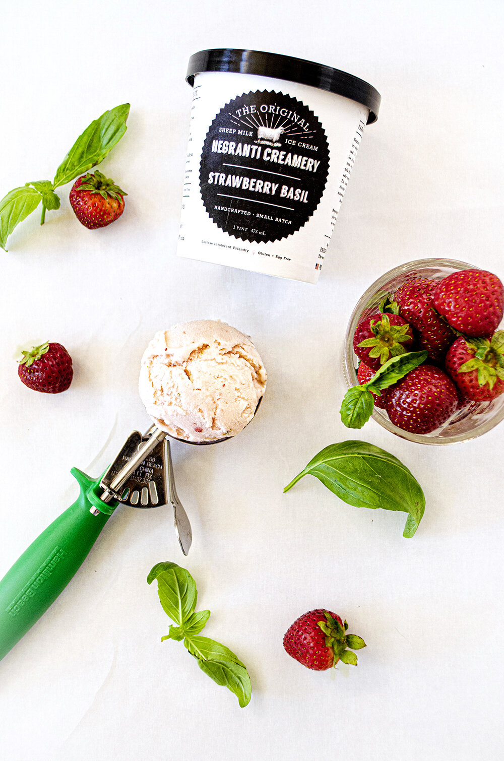
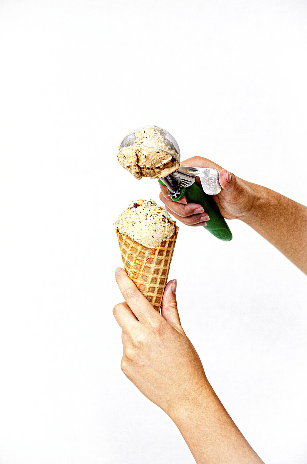
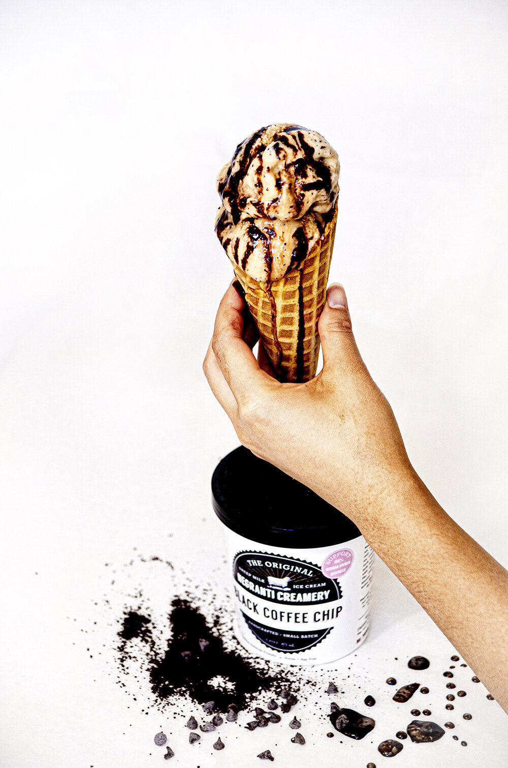
5 Pints of Ice Cream
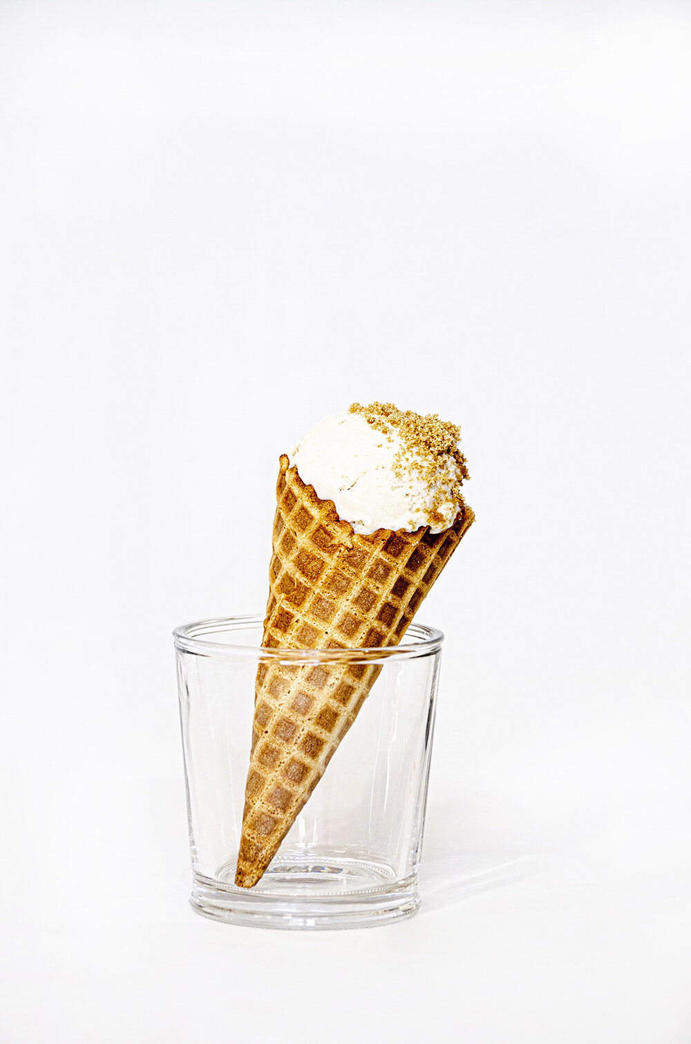
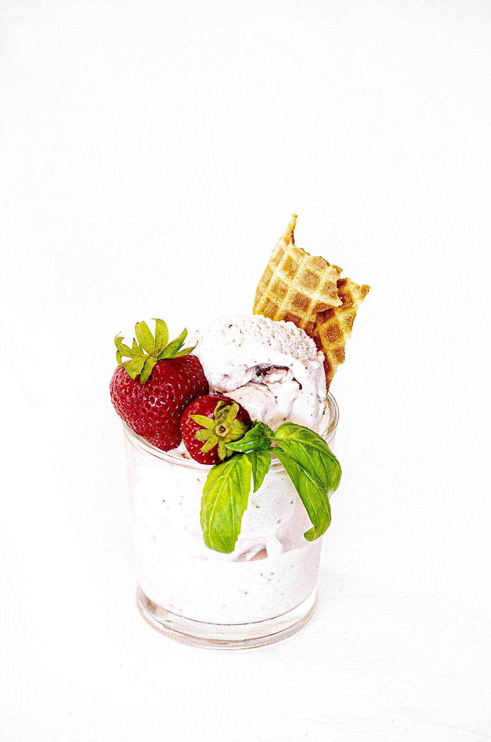
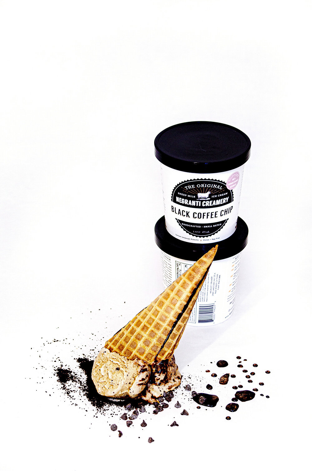
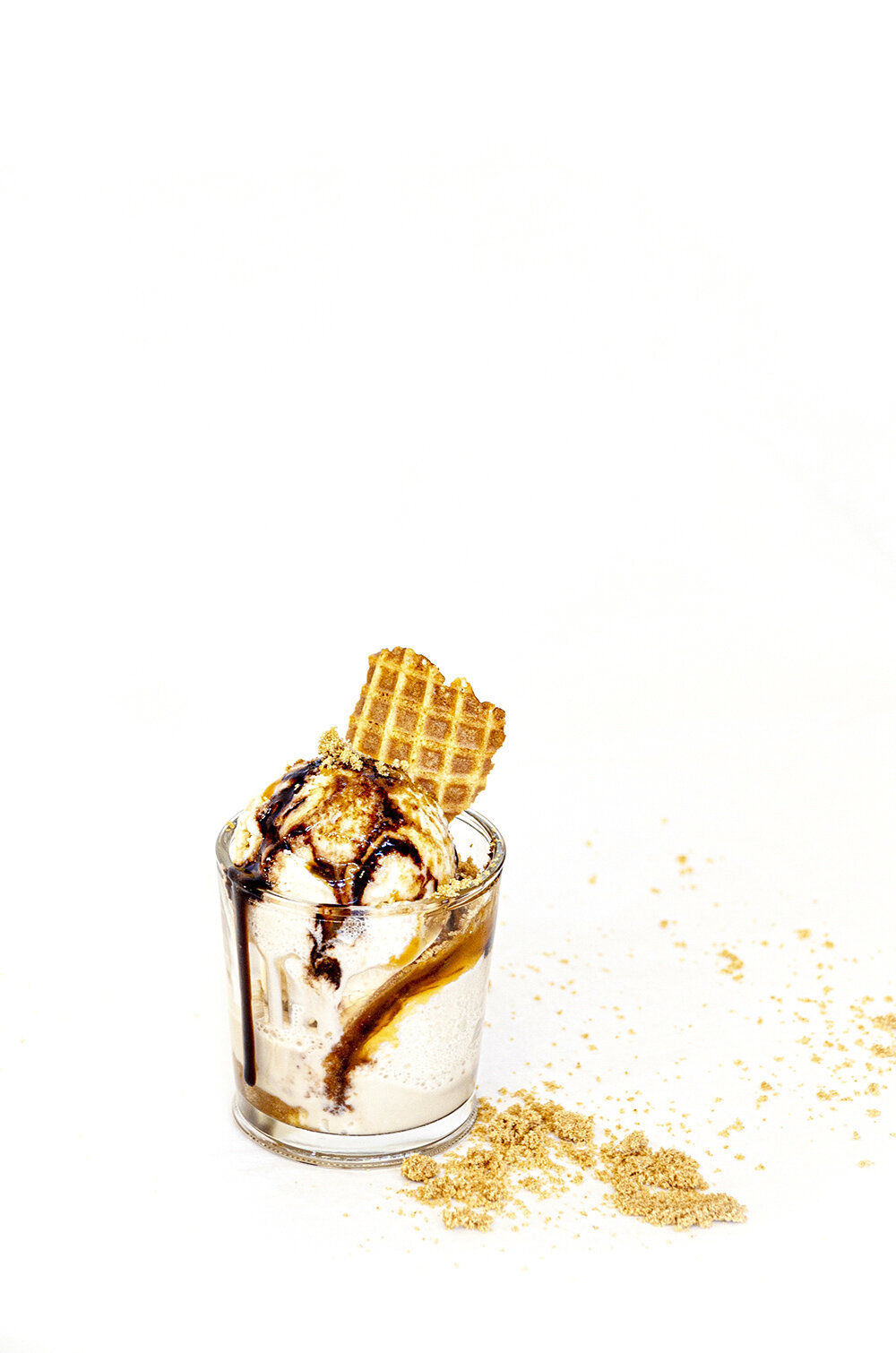
COVID-19 circumstances resulted in my move back home and away from the Central Coast. Due to this, Alexis shipped me five pints of sheep’s milk ice cream to photograph at home for social media. However, without access to the creamery’s light box in Paso Robles, I was compelled to improvise.
The Setup
The photoshoot setup was arranged in my living room, since it harbored the greatest amount of natural light. I gathered a white sheet that I used for my sixth grade Greek festival toga, a mirror, my desk lamp, and parchment paper. I styled and photographed all shots.


Post-eDit results
The Summer Collection
I was tasked with redesigning the summer menu to yield a light, classic, and clean feel — all in black and white.
Typography
I felt that the combination of Alegreya and Garamond typefaces fit Negranti Creamery quite well, eliciting an airy balance of a classic and charming yet modern-day company. Upon this initial introduction, these typefaces surface again in Negranti’s branding, shown in their ice cream sandwich packaging.

Primary
Alegreya Italic
Secondary
Alegreya SC Regular
Tertiary
Garamond Italic
Body Paragraph
Alegreya Regular

Ice Cream Sandwiches

Package Design
My next task was to design ice cream sandwich packaging in the form of a 5” by 5” ziplock bag. I was requested to work off of Negranti Creamery’s ice cream pint design (shown to the left) and to incorporate elements from the summer collection menu that I had previously designed.
Drafts
I drafted four options presenting one specific flavor. We went with the rightmost design, with the intention of using colors for flavor differentiation.


The Final Designs
Below are the final designs with variations based on flavor.


Psst…
If you’re looking for an alternative to your traditional ice cream (especially if you’re lactose intolerant like me), I highly suggest trying Negranti’s sheep’s milk ice cream. I recommend the Vanilla Bean, Strawberry Basil, and Black Coffee Chip.